CLARK / BARNES
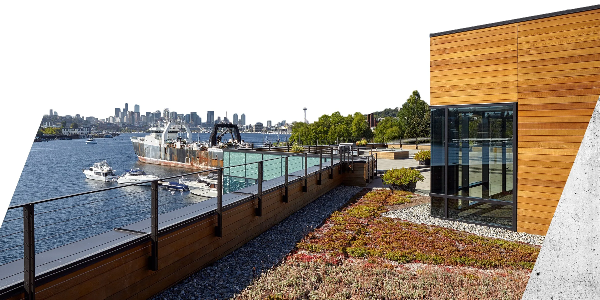
Strong Studio and Dutch St Marketing collaborated on the rebrand of a Seattle-based architecture firm, CLARK / BARNES. In addition to undertaking a brand analysis and brand extension, Strong Studio revitalized the firm’s website, social media, and collateral.
SERVICES:
• Brand Analysis
• Brand Implementation
• Brochures
• Copywriting
• Leasing Flyers
• Motion Graphics
• Print Collateral
• Social Media
• Visual Identity
• Voice + Tone
• Website
Problem / Solution
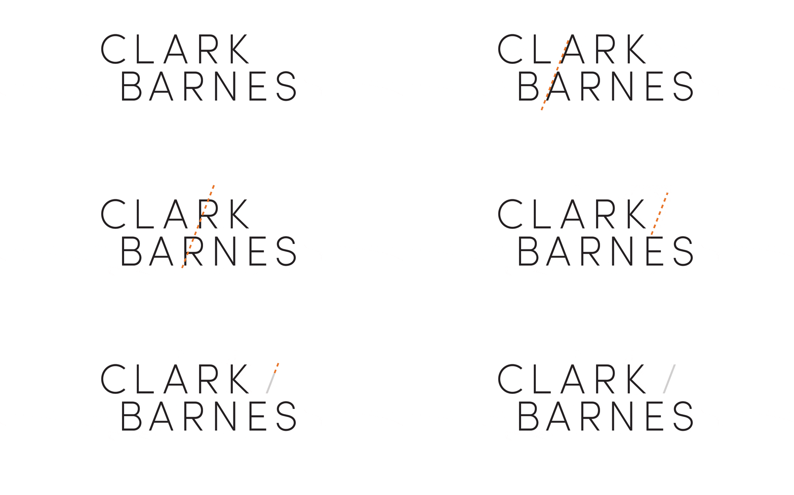
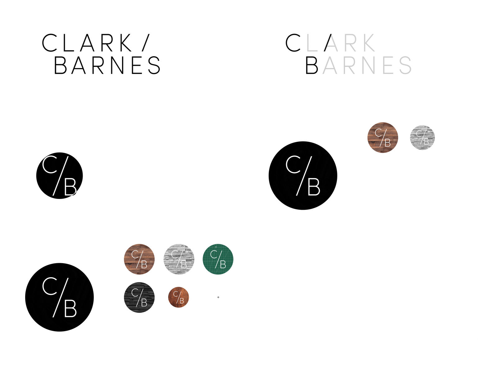
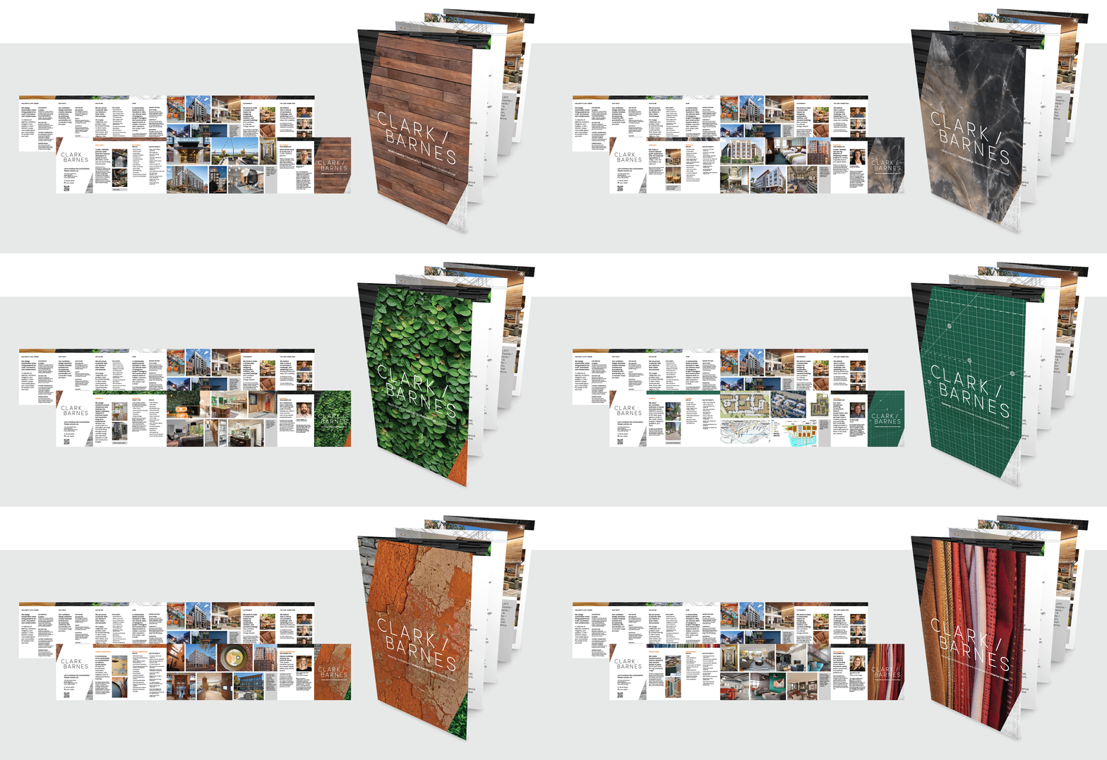
Strong Studio employed the angle of the logo to act as a divider between the names and a distinctive brand element.
We also introduced textural photography to the brand system to both differentiate business sectors and provide the firm authenticity and approachability.

Form / Function
Strong Studio applied the new visual identity system to the CLARK / BARNES website, including a restructured sitemap with additional pages to better navigate the firm’s portfolio and services.
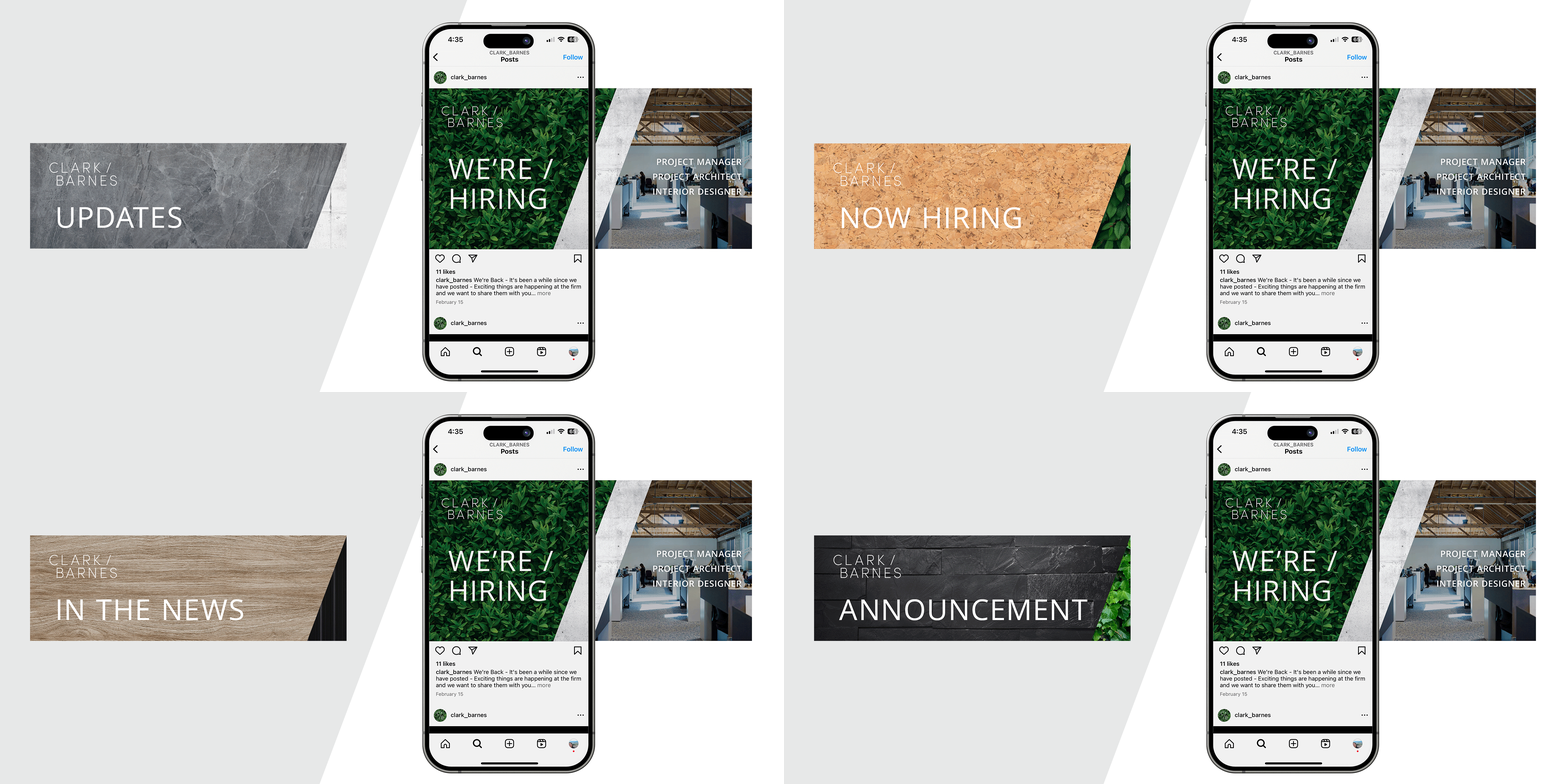
This dynamic, tactile refresh was also applied to social media and email marketing templates.


Macro / Micro
Strong Studio showcased CLARK / BARNES’ range of work through expertly designed collateral including brochures, proposals, and construction signage.

